The Metaverse Loop
Where To Begin With Facebook’s New Brand
On October 22nd, Facebook engineer and whistleblower Frances Haugen’s lawyers began to release the Facebook Papers, a damning set of documents that shone an unsightly light on one of the world’s most powerful corporations. It showed that Facebook, a company that started out as a website that ranked the hotness of CEO Mark Zuckerberg’s classmates at Harvard, was unable to moderate its own content and placed profit and public perception over the welfare of its users. It revealed that the company was not prepared for the proliferation of misinformation on its site and the effects its products had. Even the UX design itself was shown to be nefarious as Facebook engineers prioritized the angry emoji reaction over more positive ones because they knew that divisive, impassioned engagement drove up clicks. In one particularly egregious case, the papers disclosed that Facebook was aware of human trafficking happening in the Middle East via Instagram profiles being used as advertisements but only took down the offending pages after an undercover BBC investigation made the issue public.
Possibly more damning for the company's bottom line, internal documents showed that Facebook’s psychological grip on society was slipping as research showed that young people viewed Facebook proper as “boring, misleading, and negative.” Instagram — Facebook’s one-time flagship youth product — was hemorrhaging its audience as teens eschewed the false facade of influencer culture and were instead turning to the endless stream of addicting entertainment on Tik Tok and their private worlds in Snapchat. Underneath its slick UI, Facebook was losing its edge, so it did what every corporation in America does when it needs to change the narrative: they rebranded.
One week later, Facebook hosted Facebook Connect, its annual developer conference on all things virtual reality. A dazzling display in the tradition of many silicon valley CEOs who came before Mark Zuckerberg, Facebook Connect has served as the company's primary vehicle by which to tout their latest and greatest ideas and accomplishments. The keynote opened with a twinkling of piano notes and an abstract graphic resembling translucent pencil shavings with a circular Connect logo and a small disclaimer on the bottom of the screen that read:

The beginning of Facebook’s manifesto on virtual reality had begun with a warning what you were about to see may never become real.
At the end of the Facebook Connect keynote, Facebook’s name metamorphosed into Meta. It made sense, as the moniker of “Facebook” no longer represented a company that controlled multiple social media apps that serve as the primary means of communication and news for billions of people across the world. During Facebook Connect, Mark Zuckerberg — in an alien manner weirdly unique to him — enthusiastically and robotically touted the benefits of the metaverse, a hot new buzzword that means what we all used to as virtual reality. The video contained a number of products and technologies that didn’t exist yet, most comically present in a scene where a group of Meta employees sat around as full-bodied 3d avatars and played poker — a use case that looks cool in a video but doesn’t actually add a link to anything tangible within the surging and saturated world of online gambling. One of the only software products that Facebook had launched in this space at the time of the keynote was Workroom, essentially meeting software where you could transform into a Pixar-style 3d avatar from the waist up instead of a grainy realistic video square, an utterly boring use case that could only come from people who go to meetings for a living. Facebook asked us all to look away from the trash fire reality that it had helped build and instead step into one that was cartoonishly unreal and mostly non-existent.
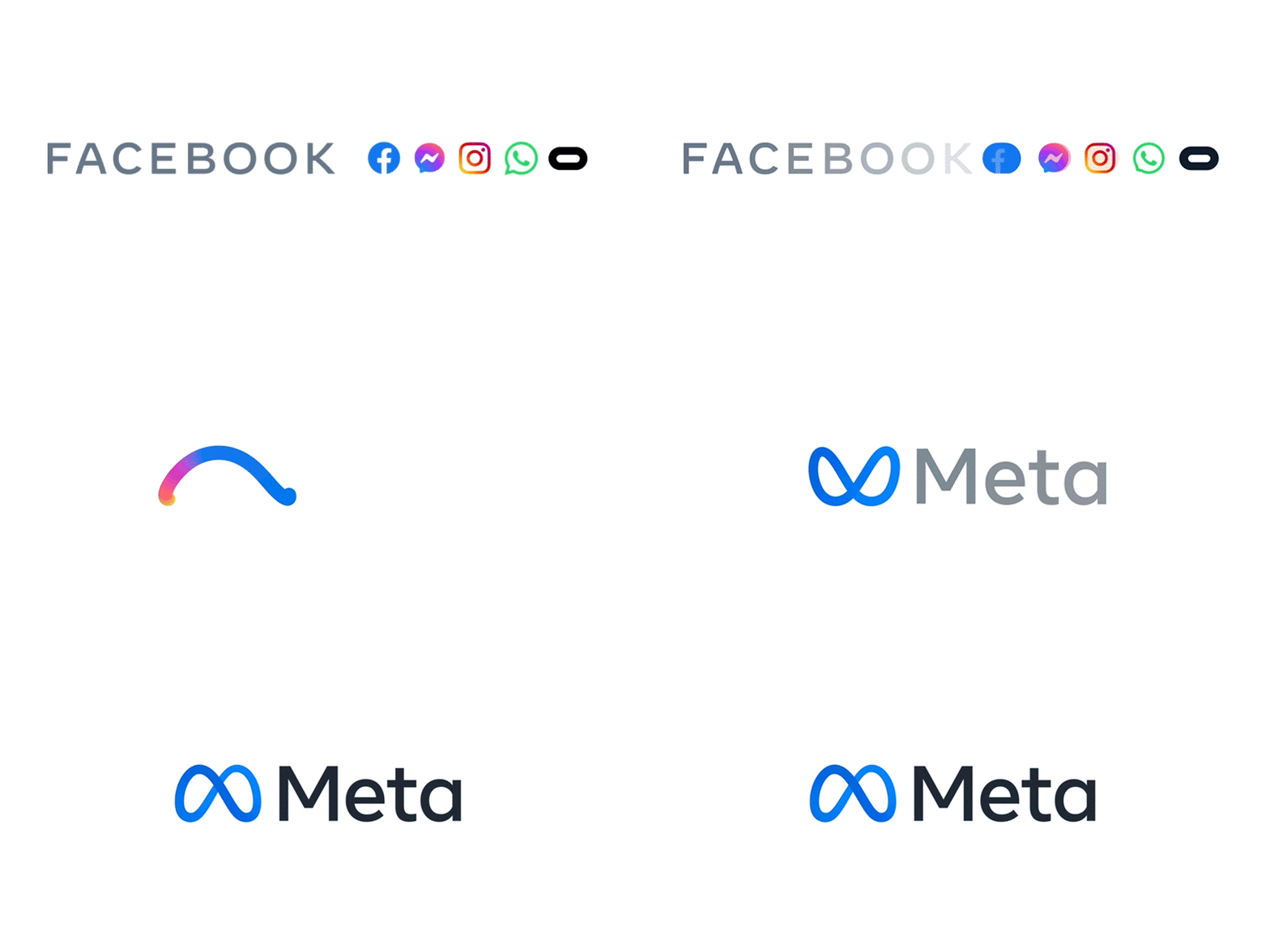
As with every corporate rebrand, the spectacle would not have been complete without the dramatic reveal of a new logo. At base, the new Meta logo is simple: a lightly shaded blue infinity symbol paired with a tasteful sans serif font. In terms of the color choice, the choice of blue is unsurprising. According to a study by 99designs, blue “appear(s) in 61% of logos from the top technology companies”. This is also by design, as research has shown that blue is the world’s favorite color mostly due to people’s positive associations with the hue: a blue sky and clean water traverses all cultures creating a pavlovian association of happiness. The typeface's perfectly serviceable: a clean sans serif with a rounded lowercase “a” which ties the logo formally to the rounded loop and the current Facebook logo. It’s not anything new or revolutionary like the language of Facebook Connect touted its product to be and that’s because it isn’t. For a corporation at its core that seems to mean nothing and everything to everyone all at once, the choices in the design language of Meta could not have been more aligned. On Meta’s official website, they credit the logo as being “designed collectively by brand and product teams from across the company”. Unsurprisingly, this is seemingly untrue, as the outside branding agency Saffron promoted their partnership with Meta’s team for the rebrand. As for the typography, Meta stated “The wordmark uses our company typeface that was introduced in 2019” which was designed with the type design studio Dalton Maag. Dalton Maag does not have the project in their public-facing design portfolio which isn’t unusual. Oftentimes, graphic designers hide certain aspects of their work from the public either for legal reasons or out of fear of judgment (for example, you will never see the work I did for ██████ and ██████ and especially ███████).
Meta described the process of coming up with the logo as “designing the future of social connection” and the choice of the word “Meta” because it can mean “beyond”. Each piece of messaging in the brand guide hinted at moving on from the past, away from what Facebook is and will likely always be, and into an unknown three-dimensional future. In terms of the choice of the infinity symbol, the Meta team seemed to be hoping to convey the most basic level interpretation: "symbolizing infinite horizons". But in looking at the history and varied interpretation of the symbol, there were apparently some meanings that the design team responsible for producing Meta chose to ignore. Meta in the “beyond” definition literally means “after” — in the keynote Zuckerberg referenced a love of Classics but seemingly missed this point (Aristotle notably chose to name one of his most famous writings Metaphysics as it just meant it was the book following Physics). Interestingly, Facebook avoided mentioning the other canonical definition of “Meta” as an adjective that is used to describe anytime something is self-referential. This was popularized in Douglas Hofstadter’s book Gödel, Escher, Bach, a complex book that also coined the term “strange loop” which happens when one enters a seemingly hierarchical system you somehow end up back where you started. Visual examples of strange loops include M. C. Escher’s drawings Waterfall, Drawing Hands, Ascending and Descending, Rene Magritte’s The Tyranny of Images, and at its most simple form: a Möbius strip or what we call an infinite loop. The choice of Meta’s logo taking this form is in contradiction to Facebook's attempts at creating a “successor to the mobile internet”. Anywhere your eye travels along the Moebius Strip will always take it back to where it’s already been.
The promise of the metaverse to allow us to “express ourselves in new, joyful, completely immersive ways” feels fickle because we can already do that in the real world, and arguably best outside of the products built by Facebook. Parts of the keynote alluded to moving through the metaverse with your own set of goods and clothing, expressing yourself in new and unique ways. But in a different section of the keynote, it promised us realistic-looking avatars that looked and moved exactly as we do, no different from what we see in the mirror every day. At the beginning of the presentation, Zuckerberg flipped through a virtual wardrobe featuring a skeleton bodysuit and a spacesuit before setting on his usual uniform of a long sleeve shirt and jeans. If the company’s CEO won’t choose a new form of self-expression and instead rely on a mirror of himself, how can it expect its users to do so? The messaging around Meta and its unbuilt world of expressionless creativity create a sort of strange loop that Meta in the end is actually not yet Meta, Meta is Facebook and may always be.
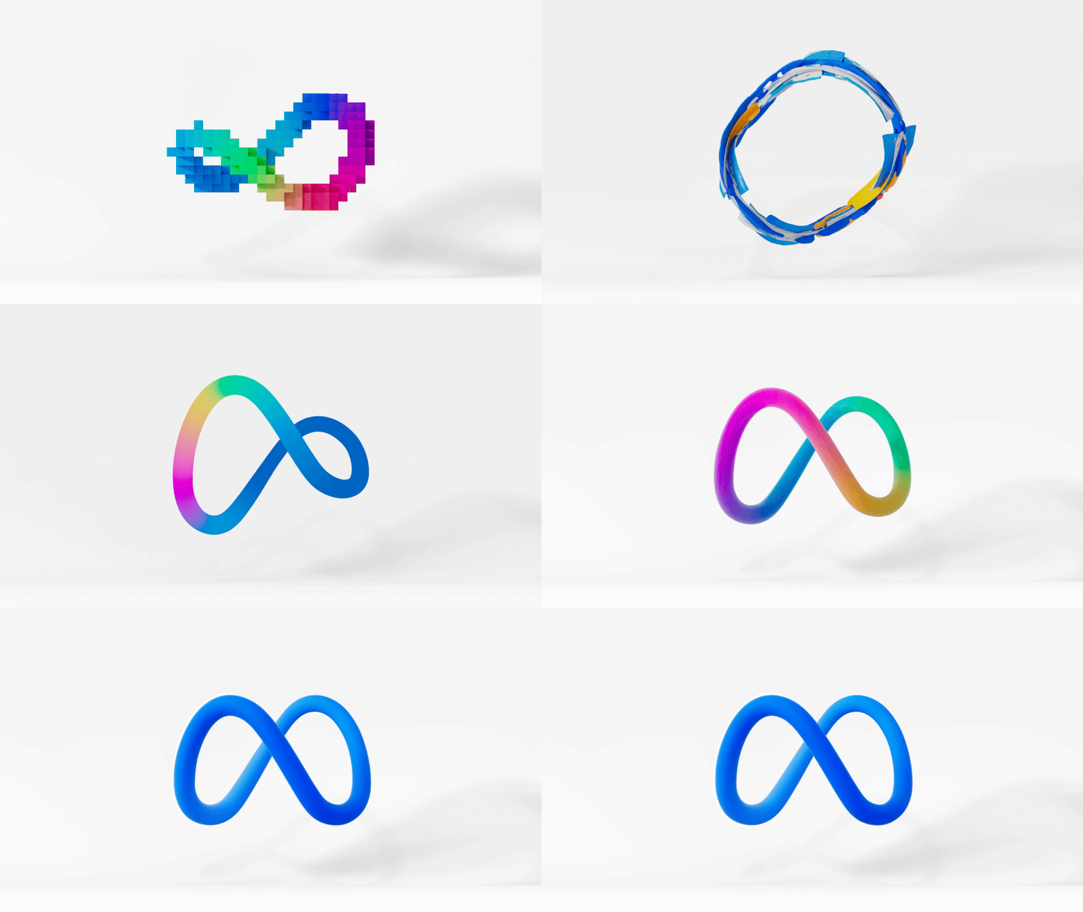
In the minds of Facebook, the logo is merely not a flat infinity symbol but “designed to dynamically live in the metaverse — where you can move through it and around it.” Corporate logos existing in real three-dimensional space have been around since the dawn of modernism, with some designers such as Lance Wyman building their practice around this very field. But technologically speaking, the metaverse is relatively new, and creating the logo in 3D makes sense because metaverse. But if you take a look at Meta’s website or any other press for Meta, the logo is primarily rendered in 2D because, in reality, it isn’t much different from any other logo: it’s just a combination of 2D shapes and letters. It’s an interesting use case and may signal the future of logos at some point, but in 2021 that’s not how logos work. Logos are often more so designed with the intent of being timeless rather than futuristic and trendy in the world of corporate America because they need to appeal to a broad audience and have a wide number of use cases. The branding for Meta is an attempt at both: it’s averse to visual risk but still embraces new technology, but having it both ways is a near impossibility. It looks no different than most corporate logos and adding the metaverse use case is a play at making it more exciting, but as venerable graphic designer Paula Scher put it “making a logo more flexible risk(s) making it less recognizable.”
The fact that it’s marketed as a three-dimensional model ultimately feels like an afterthought, a flat peg forced into a 3d orb. Meta touted how the logo “can take on infinite textures, colors, and movement, capturing the creativity and imagination of a 3D world.” This form of dynamic logo is essentially a 2021 update of the landmark dynamic logo for MTV — designed by Manhattan Design studio in 1981. At the time, the MTV logo made sense as it was meant to represent the ever-evolving visual tastes of the youth. In 2021, Facebook’s application of different 3D textures and materials was described as “capturing the creativity and imagination of a 3D world”, but really it feels as though they did it because they could, an idea that came from 3D technology instead of communicating an idea or an understanding of its users. Dynamic logos tend to rarely stay dynamic because the resources required to keep them fresh need to be invested in in meaningful ways in order for them to keep them shifting, but often the upkeep of a logo is seen as unnecessary to the financial success of a corporation.
The sad truth about Meta’s investment in this space is that video games such as Fortnite and Roblox are already much farther along in building the metaverse than Facebook is. And the branding for these games is far more playful and exciting than any of the products that were promoted in the Facebook Connect video. I can’t help but think of people’s relationships with authenticity on the internet, it’s what drives memes and TikToks and tweets and connects us in ways that are unbranded and low fidelity. In the context of traditional graphic design criticism, the Meta branding is good, but it’s also cold, empty, and devoid of real meaning which anyone with the privilege to be able to use this technology could spot from a mile away.
I came to graphic design with a love of logos. It's a magical power to be able to visualize culture and communication and create a community around a visual language. But the dark side of branding does the opposite: it creates a lie that tricks people into believing the symbolic meaning over lived experience. Companies can use graphic design as a funhouse mirror, distorting and covering up the skeletons in their closet with positive symbolism and cultural eye candy. What’s so fascinating about the Meta branding is the blatant deceitfulness of the whole charade. The future that Meta laid out may very well come true, it has endless resources and unregulated power to make their metaverse our new reality. But I remain skeptical, because if their vision of virtual reality can’t even promise its own existence on arrival, the snake very well may end up choking on its own tail.


